Designing a learning experience from the content up
The problem
Support content at RingCentral is like a bunch of little fiefdoms. There are videos, knowledge base articles, and training. Everything lives in its own world and its own page with no connection between them all. Videos in particular are not easy to find and fit awkwardly into the UI. If you're a FTU, it's hard to find quick answers and tips in video form. Conversely, if you're a returning user who has watched a specific video before and wants to dive deeper into that topic, it's hard to find related training and courses.
The goal
We found that users who completed at least the intro course in RingCentral University were less likely to churn after the first year with RingCentral than users who did not take any courses. Be that as it may, our clumsy support site made it tough to actually find and take a course.
Our goal: Create a unified learning experience where how-to videos and knowledge base articles will live, allowing inquisitive users to discover additional relevant content like training and coursework.
User archetype
I developed the following user archetype to guide us through this process based on previous interviews from the UX research team:
Informational needs
How do I do XYZ thing in RingCentral?
I’m not a customer yet, but how can RingCentral help my business?
Jobs to be done
As a new customer, I need to learn how to use RingCentral
I need a quick answer to a relatively simple problem
I need in-depth product training
Psychological profile
While conducting research, I identified a few key psychological principles that made other learning and video streaming sites successful:.
Social proof: show what others are watching
Authority bias: content recommended by someone who is an expert or leader in their field
Customizable watchlists: make users feel like the homepage belongs to them as opposed to one generic page for everyone
Discoverability: content is featured in many different ways (what’s new, recommended for you, keep watching, etc.)
Zeigarnik effect: people are compelled to finish something they’ve started (like a video)
Hick’s Law: the more content shown, the harder the decision to pick something
Paradox of choice: users won’t choose anything if there’s too much to choose from
Ideation and discovery
We started this project with a look at other support sites. Since RingCentral had a lot of video content, I suggested we look at popular streaming sites too.
To guide the IA for the new learning site, I conducted a quick card sorting exercise with RingCentral employees. Cards featured a sampling of different types of content. Subjects were asked to both sort the content into buckets and name the categories.
Once research was complete, I took a pass at interpreting our findings, paying attention to what worked well and what did not. On the right, you can partially see the content labels I wrote, using the findings from the card sorting exercise.
Design requirements
Meeting with the product designer and product manager, we created a wishlist of design requirements then plotted out these requirements on a value vs. feasibility matrix. Anything in the upper right offered great value to the user while also being relatively easy to design and develop.
With requirements in hand, I wrote the design document, outlining the problem, objective, and requirements.
Product and Design teams coming up with design requirements in FigJam.
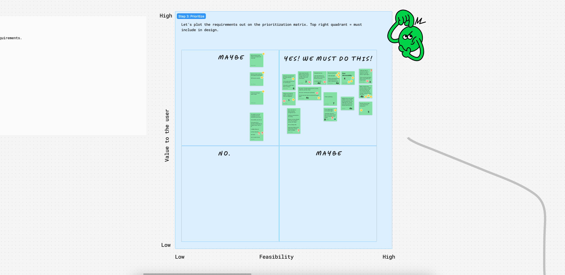
We plotted the design requirements on a value vs. feasibility matrix.
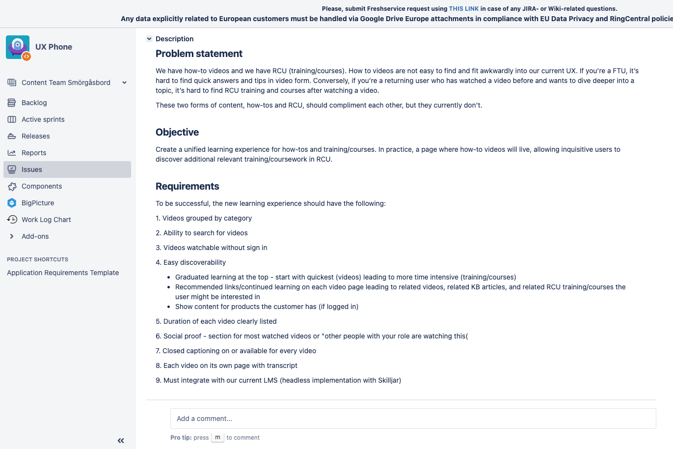
I wrote the document, guiding our work on this project.
Validation and results
Results TBD. The new learning site, which I named Watch and Learn, is still in-progress. I just wanted to include a quick and dirty example of content-led design work I did recently at RingCentral.